I received this project request from the CNP (Core•NBU•Payments) team out of Google's New York offices. The request was to design a set of static graphics to be used in various internal team pages and slide decks for upcoming presentations.
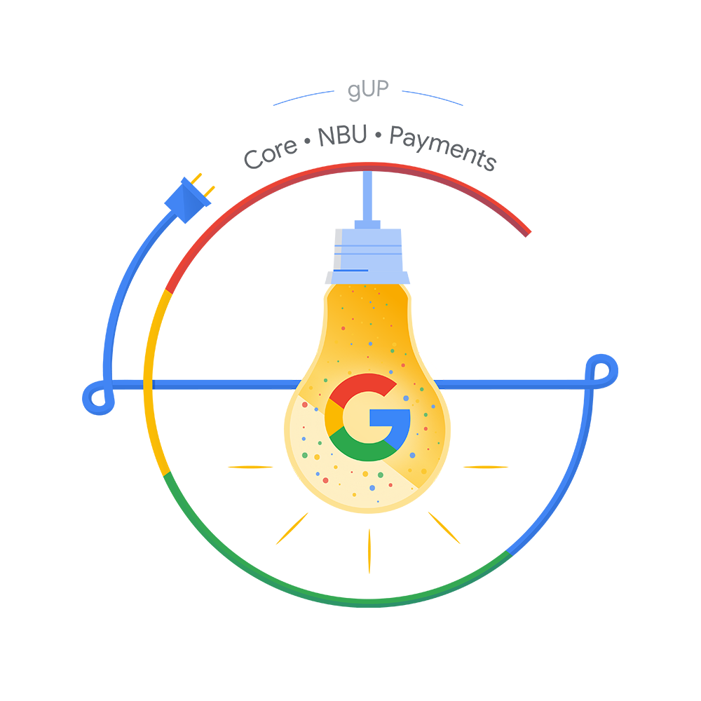
The assets requested consisted of one hero image, 3 key illustrations and a logo design. My first thought was to reference Google visual language docs to ensure that the designs I create would be on-brand and fall in line with Google's overall aesthetic. From there, I began a keyword search from the creative prompt to research similar designs and begin my initial sketches. I decided to work the designs around a sort of "Olympics" theme to tie them all together.

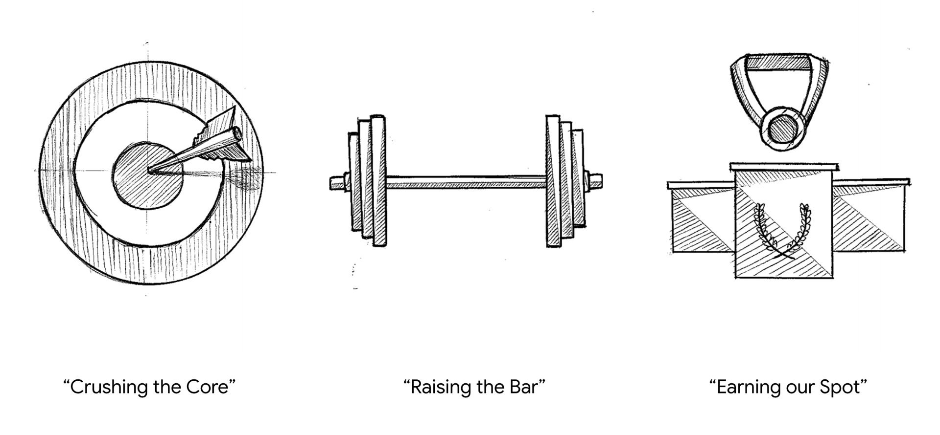
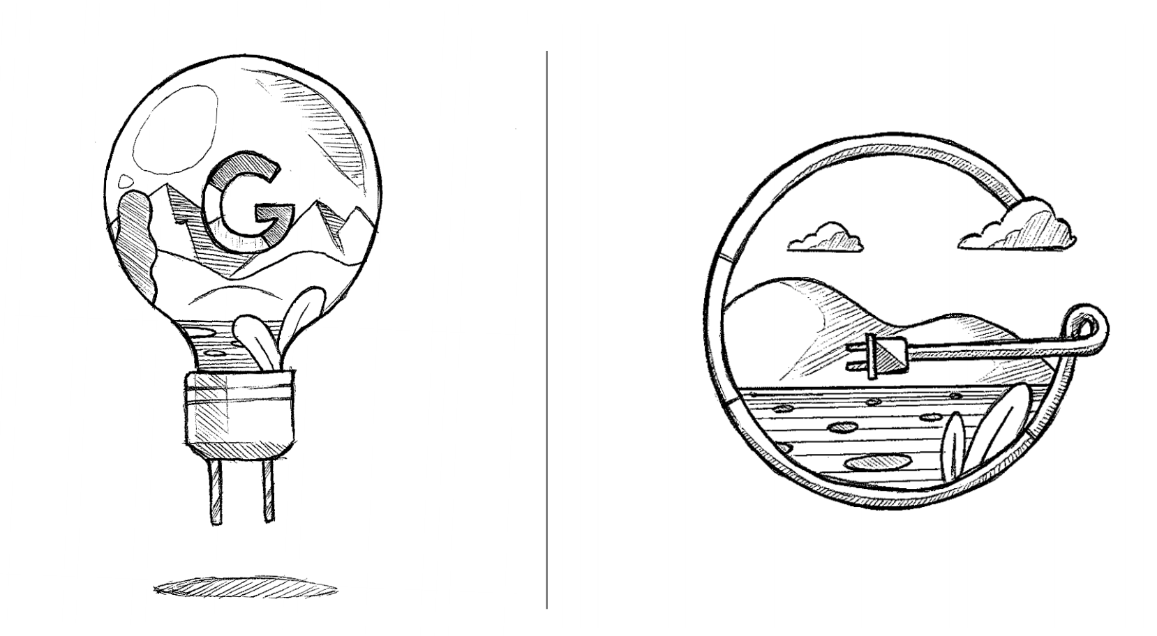
The illustrations were presented to the client on the CNP team in which I received the first round of feedback. Based on the feedback, I altered some of the designs and started work on a first draft full-color render. I decided to theme the color palette based on the primary Google colors and correlate each illustration to a different Google color. Most of the work was done in Photoshop and the finished graphics were then presented to the client.


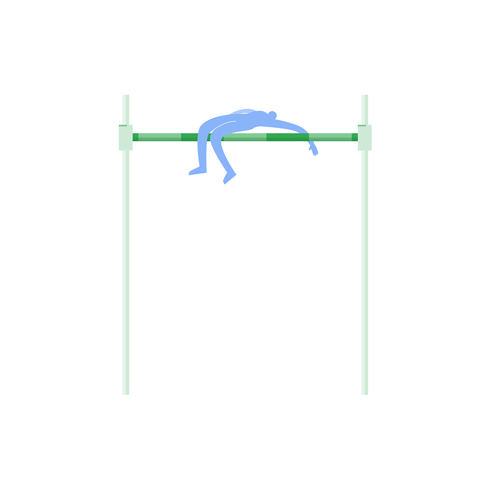

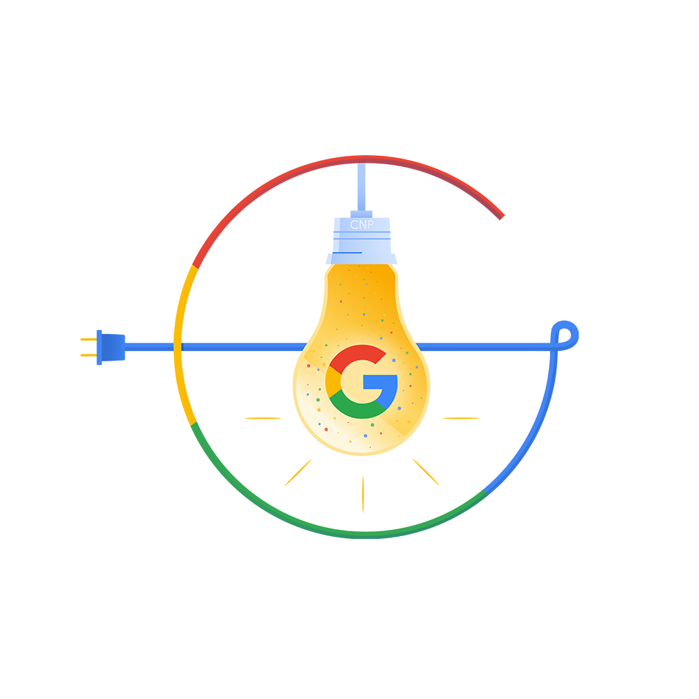
The feedback I received was that this direction felt a bit too rigid and the client wanted something a bit more dynamic and "cartooney". After this round of feedback I got back to work(this time in Illustrator) and took some inspiration from cartoons from the 1960's in which I over-exaggerated some of the proportions and changed the angles. I also decided to incorporate all four Google colors into each of the illustrations. This second draft was again presented to the client.
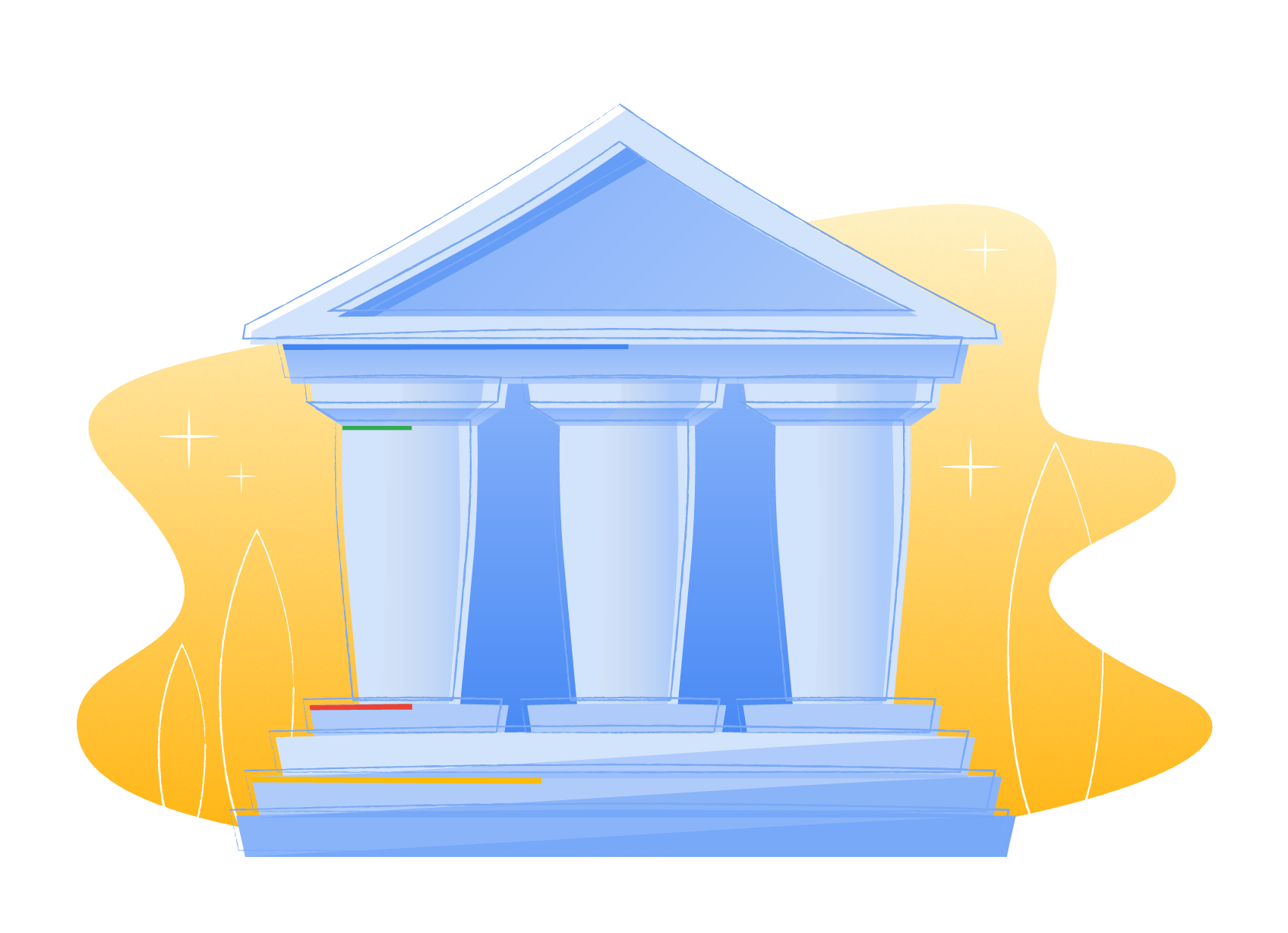

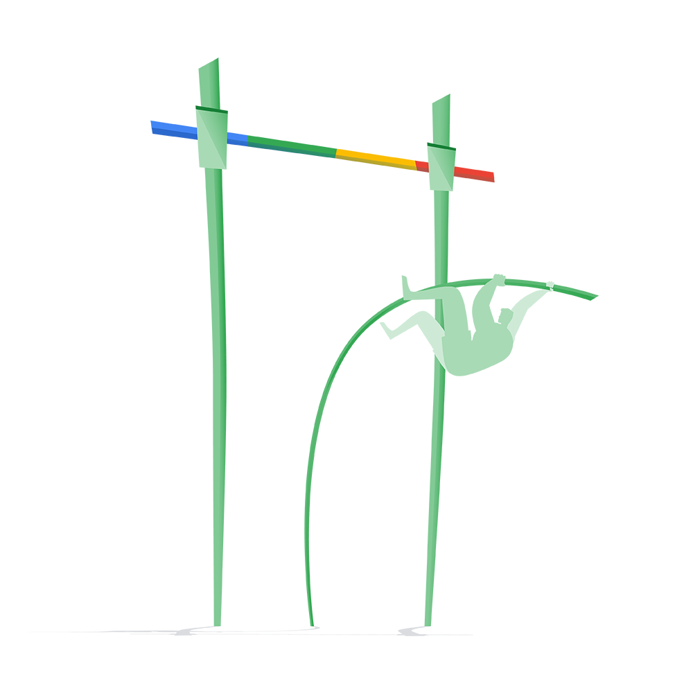


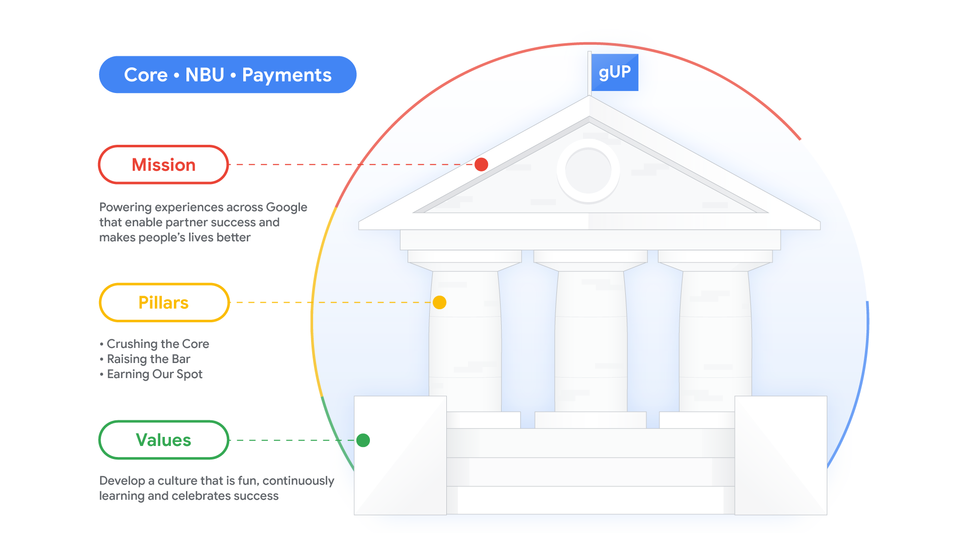
After syncing with the client, the feedback I received was that the angles and proportions were too exaggerated and that they preferred the images facing forward towards the viewer. Also, the Greek building illustration was meant to serve as a sort of infographic with accompanying text so I went back to the drawing board taking all of the previous notes into consideration. I reigned back the "cartooney" aesthetic and found a healthy middle area that incorporated the best of both drafts. The Greek structure illustration was over-hauled and some minor tweaks were made to the logo. The finished product was again presented to the client which was extremely well-received.


This was the first project I was assigned to at Google and it was definitely a roller-coaster. I had initial nerves from the pressure of performing well on my first project but I was also determined to ultimately present the client with a finished product they would be happy with - and they were! This was a new internal client and after having a positive experience, the client sent more creative requests and also recommended our services to other Google teams.
