
This project request has possibly been the most extensive project I've ever worked on. I was tasked with the redesign of the Tools Academy site. Tools Academy serves as a training platform with extensive training modules for customer facing teams across the Google spectrum. In total, the request consisted of 108 deliverables ranging from logos, buttons and icons to hero images and character illustrations. The expected time frame of completion was around 4 months and I take pride in having completed this entire project with several revisions in just under 2 months from conception to finished deliverable.
Homepage
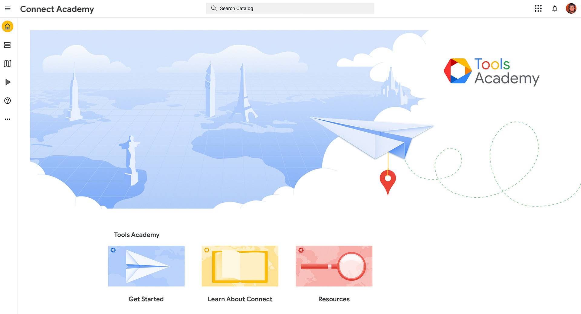
The first set of assets I worked on were for the Tools Academy homepage. The deliverables needed were a hero image and 3 buttons. The creative prompt asked for a hero image that would encompass the Tools Academy as a whole and the buttons were the starting point to each subsequent tool. My initial idea was to create a "traveling around the world" theme to play on the different cultural backgrounds of each character.
Below is the first draft I rendered and presented to the client. The feed back I received was that the goal for these assets was to deliver a clean, concise aesthetic using a ton of negative space with color accents. I was also told that the hero image and buttons looked like something geared more towards Google maps rather than a learning platform, which in retrospect I absolutely agree with. As for the logo, the client requested the text be a single color and the emblem should include imagery consistent with a learning objective.


After receiving the clear feedback, I went back to the drawing board and decided to strip away a lot of the background and surrounding framing device. I was now going for a simple, minimalist look, with just the essentials. Below is my 2nd draft that I presented to the client. I decided to use the imagery from the buttons to tie into the theme of learning. Although much better received, the feedback I got was that it was a bit too "stripped down." The buttons were concise but lacking something. The client liked the direction of the hero image but wanted something more modernized in terms of representation of a learning platform (all training modules are online.) For the logo, the client wanted a different emblem housed inside of the blue hexagon.

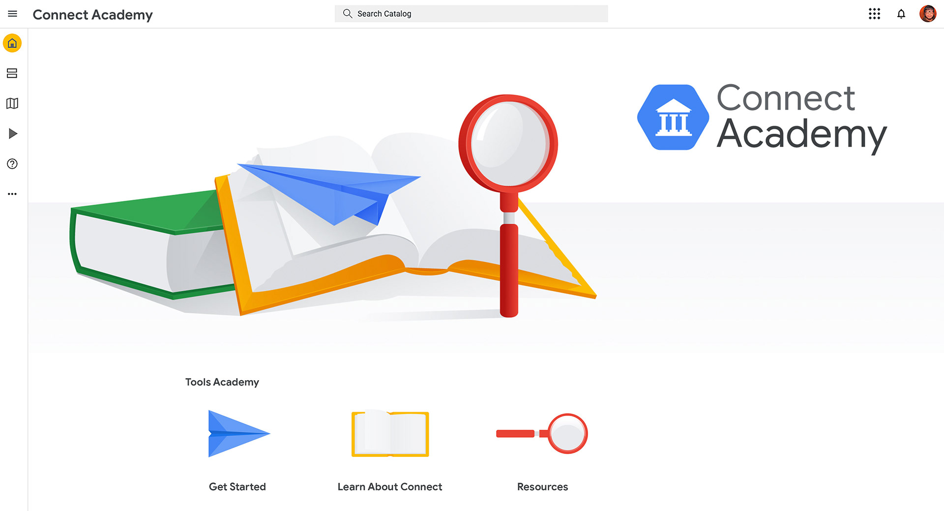
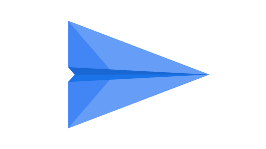
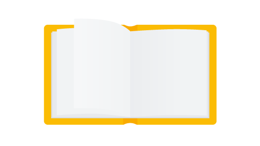

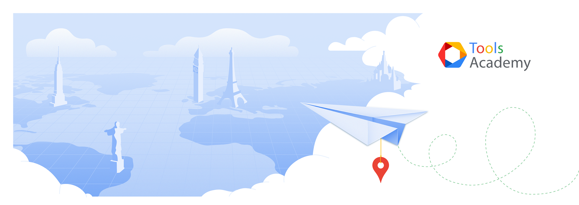
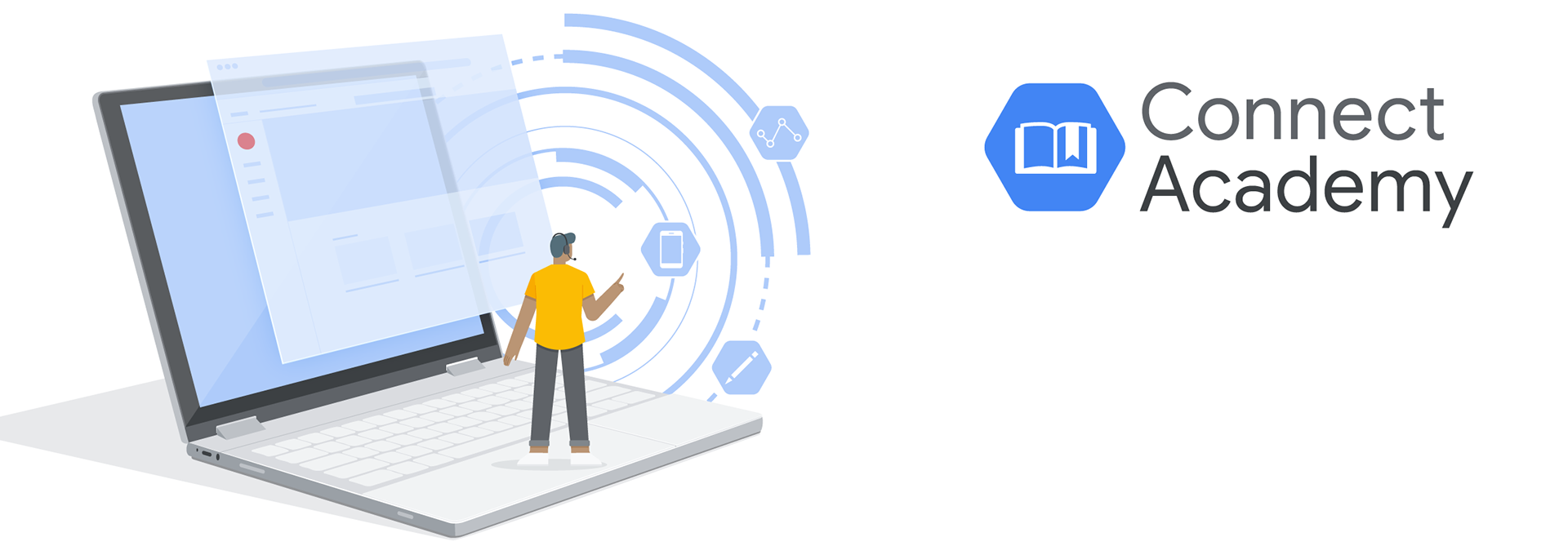
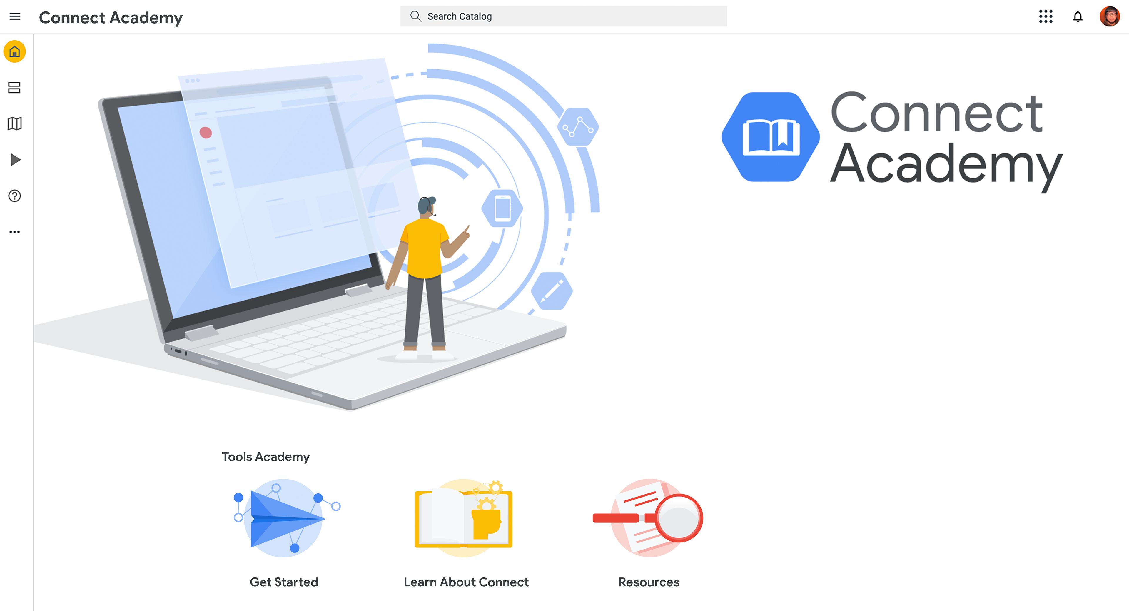
Now that I was headed in the right direction, I knew I just needed to tweak some things to get the overall theme to click. I opted to modernize the hero image with a Pixelbook rather than physical books to represent "learning." The theme I was playing with now was "small people, big world." I illustrated a minimalist view of the home page projected from the screen with concentric circles and icons cycling out of the laptop. The design of this hero image set the tone for all of the character banners for each sequential tool page. For the logo I swapped out the greek structure for an open book with bookmark. As for the buttons, I overlapped the images on a simple circular frame with additional supporting imagery to give the buttons more movement and life. This 3rd draft was extremely well received and the client loved the direction. I was very satisfied with the final draft and I'm glad I was challenged to find more harmony in the design.


Tools
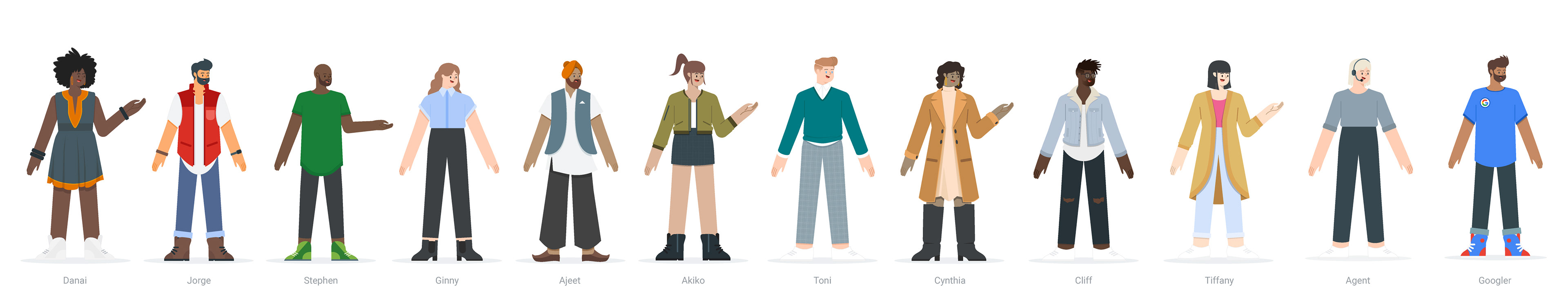
In addition to the homepage assets, I was also tasked with (re)designing character assets that would accompany 10 different tool pages each with their own hero banner, buttons and illustrations. Below is the full set of characters I designed. I go into more detail on the design of these characters on the Character Toolkit page. Follow the link below to view the full set of character illustrations and assets associated with each character and their respective tool!
Generic Graphics
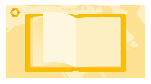
Here are some generic graphics that were also requested by the client. They were meant to be utilized through out the learning modules. Below is the first draft that I presented to the client. These were presented along with the homepage assets and the feedback I had received was to design something a more simplified and clean aesthetic with more negative space.


For the 2nd draft, I stripped away the background and opted for a simple circular frame. I also removed all gradients for a flatter design. This draft was better received, however the client felt it was a bit too flat and wanted it to be a bit more dynamic.


Below is the 3rd and final draft I presented to the client. I added subtle gradients back in to give the design more dimension and pop. The client loved this version of the design.